For my Design Hero blog post, I chose to write on Archan Nair. Nair is experienced in illustration and mixed media in addition to digital art. Born in 1982 and from New Delhi, India, Nair originally started in the fashion industry working in his family business of apparel manufacturing and export, and developed an interest in digital art later in 2006. He has collaborated with companies such as Pepsi, Canon, Nike, Sony, Tiger Beer, and Microsoft. He has also been featured in many publications, including GQ, Vanity Fair, Digital Arts, Juxtapoz, Behance, Advanced Photoshop, Computer Arts, and has even been recognized by musicians such as Kanye West.

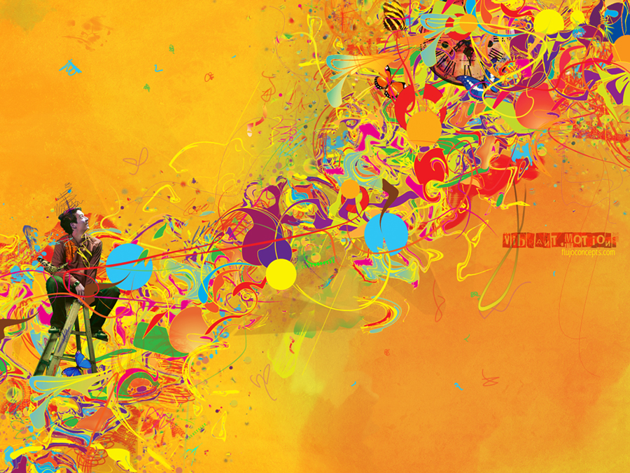
What I love most about Nair is how he is inspired to create such works of art. Like me, his artistic talent is driven by emotions and feeling. Art that is created with this is mind is what moves me the most. Even music can be amazingly inspiring and lead to whole new creations, digital, illustrative, or otherwise. As a huge fan of Romanticism and the art from that era, I can really be motivated by his work. (In fact, he reminds me of my favorite painter, J.M.W. Turner, a 17th century English Romantic landscape painter, who also utilized the emotive power of color to create remarkable works of art.) Nair uses such beautiful bursts of color that harmoniously intertwine to create a unified work of art. His works are so creative and unique, yet they all have a common unifying theme of color, repetition, and harmony of lines and shapes. I can see his art and really feel something that is personal to me. They are beautifully surreal and imaginative. I love this type of art, and I feel like it sort of fits into how I tend to design and approach art, whether it is graphic design, drawing, or photography. It is whimsical, emotion-driven, passionate, has lots of color, and is even surreal sometimes. His work is also one of my inspirations for my current project for the class. His culture, the people he meets, and the events he experiences are also all contributing factors to his creation process.


I wish I could tap into the reserves of my mind like he does, and pull out limitless creations to express my feelings and emotions. I feel like that is why I love art so much; it is the best way to communicate what it is you are feeling, to let it all out rather than be kept caged. I think it would be really interesting to be able to sit and down and talk with him about his creation process and how he seems to find a way to digitally express exactly what’s going on in his mind. And I love the positivism of his pieces; they are usually bright with lots of color, and are often dream-like in appearance, though some will express feelings such as anguish and pain, and are perhaps even more visually powerful. You can really feel something when you look at his work, which really is the ultimate goal of any work of art, in my opinion.
Illusration produced for GQ Magazine
You can view more of his art and learn more about him at http://www.archann.net/
Bibliography
"About Archan Nair." Archan Nair Creative Showcase. 2011. Web. 20 Oct. 2011. <http://www.archann.net/pages/info>.
Dos Santos, Alessandra. "Interview with Illustrator Archan Nair." Abduzeedo | Graphic Design Inspiration and Photoshop Tutorials. 17 May 2009. Web. 26 Oct. 2011. <http://abduzeedo.com/interview-illustrator-archan-nair>.